
Commercial Thinking
The attention budget of a can label
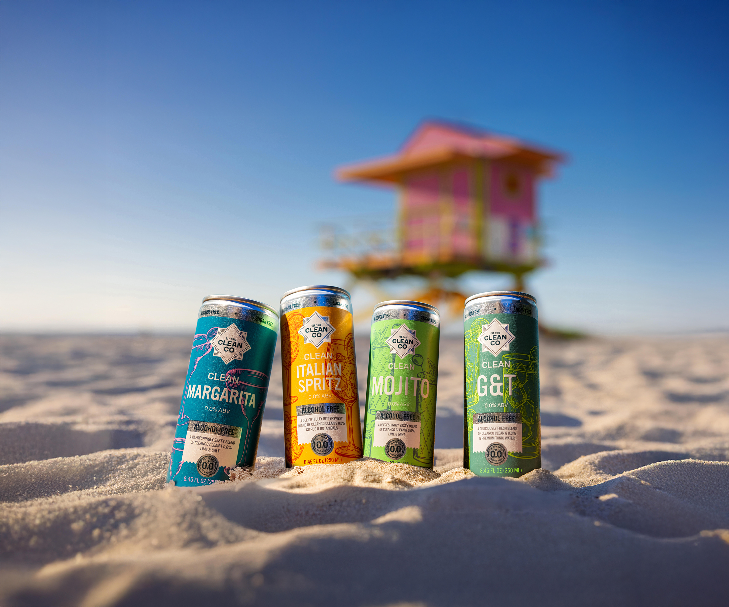
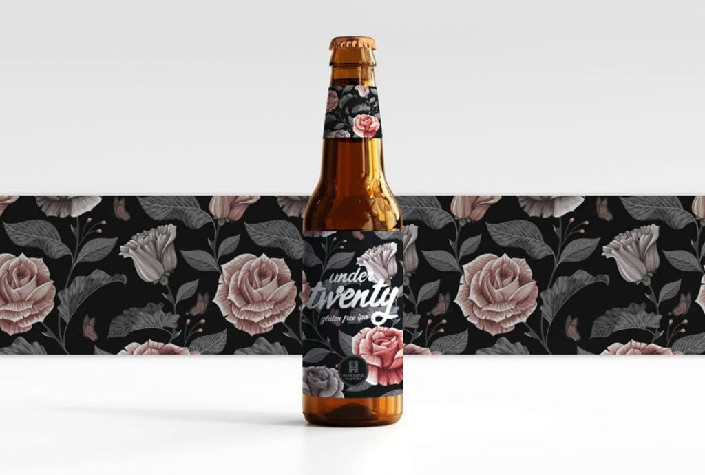
CleanCo’s new alcohol-free ‘ready to drink’ cocktail cans have gone live for pre-order this week. I worked on the label design for the range, and one of the most interesting parts of the project was the tension between branding and selling.
The Brief
Packaging has a harder job than most people give it credit for. A can has to be distinctive enough to feel like the brand, but clear enough to help someone understand the product quickly. Lean too far into brand and it becomes stylish but vague. Lean too far into selling and it becomes cluttered, defensive and eventually forgettable. The best packaging holds both in balance, and the balance is rarely equal.
Lean too far into brand and it becomes stylish but vague. Lean too far into selling and it becomes cluttered, defensive and forgettable.
The 70:30 rule
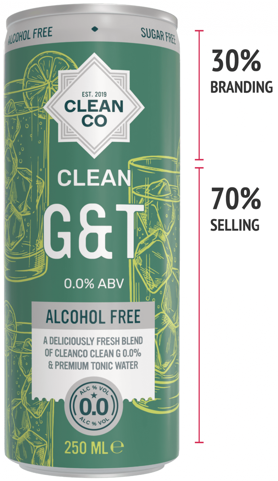
A useful rule of thumb is that front-of-pack design should be roughly 70% selling and 30% brand. Not 70% of the surface covered in claims and messages, but 70% of the attention directed towards helping someone make a decision. What is it? What does it taste like? Is it alcohol-free? Is it ready to drink? Does it feel like a grown-up version of the cocktail it is inspired by?
These are selling questions, but they still need to be handled with some taste. The product name, flavour, format and key details need enough room to be understood at a glance, particularly when the can appears as a thumbnail on a Shopify grid, inside an advert, or in a social feed moving faster than anyone would like.
The remaining 30% is where the brand earns its place. The logo, the colour system, the tone, the overall composition, these need to make the range recognisably CleanCo without overpowering the information someone needs in order to buy. Brand presence is not decoration. It is the part of the design that builds trust before a word has been read.
Brand presence is not decoration. It is the part of the design that builds trust before a word has been read.
The Alcohol Free Problem
This balance matters more in alcohol-free drinks than it might elsewhere. The customer needs clarity, but the product cannot afford to feel apologetic or overly functional. It still needs to feel like a cocktail. It still needs appetite, personality and some sense of occasion. An alcohol-free drink that looks like it is working hard to justify itself has already lost something, because the feeling the product is trying to sell is ease and pleasure, not effort.
Hierarchy and the compressed surface
Hierarchy is where this gets resolved, and it is finer work than it might sound. A can is a small surface and every element is competing for attention. The brand creates recognition. The product name creates understanding. The flavour creates desire. The alcohol-free message removes the main doubt a customer might carry. The supporting claims, handled well, give someone enough confidence to move forward without pulling the design into noise. Each element has a job, and the moment any one of them starts doing someone else’s job, the whole thing starts to slip.
Each element has a job, and the moment any one of them starts doing someone else’s job, the whole thing starts to slip.
Designing for eveRy surface
The can also has to work across very different environments. In someone’s hand it can reward a second look. On a shelf it needs to hold its own within the range. Online it has to stay legible at small sizes. On social media it may have a single second to say something before the feed moves on. Front-of-pack design that treats itself as purely visual, without thinking about how it performs across all of those contexts, tends to look good in isolation and underperform everywhere else.
The Job before the first sip
Good packaging does not ask the customer to work harder than they need to. It gives them clarity, builds enough trust to lower their resistance, and creates enough desire to move them towards buying. Before anyone has tasted the drink, the can has already been doing its job. The best ones make that look effortless, which is precisely why it is not.
Check out the new range on CleanCo’s website.
Related Design Projects

Brand Identity & Packaging Design for Wolfbury Gin
Branding & Packaging Design
The Suffolk Distillery

Latest Shopify Guides & Articles
A collection of articles exploring Shopify UX, ecommerce structure, conversion thinking and the commercial decisions behind effective online stores.
-

How to sell online like a boutique, not a brochure
Commercial Thinking
15 Minute Read
-
Shopify Agentic Storefronts Guide
SHOPIFY AI GUIDE
15 Minute Read

GET IN TOUCH
How can I help you?
Published
Last Updated