
Commercial Thinking
How to sell online like a boutique,
not a brochure
Balancing brand atmosphere, product guidance and customer confidence,
because atmosphere alone does not convert the sale
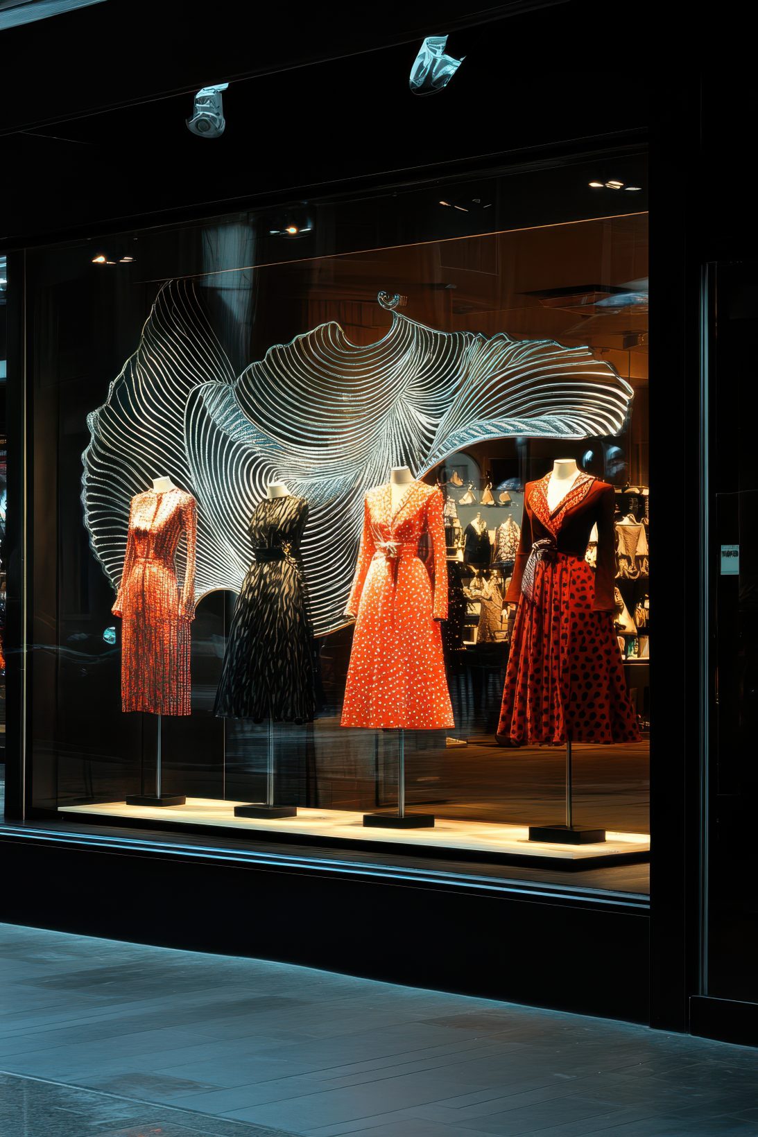
Walk into a good independent shop and you feel the difference almost immediately. The range has been chosen with care. There is a point of view behind every product. The advice, when it comes, is specific rather than vague. You are given space to browse, but you do not feel abandoned.
That is the difference between a boutique and a brochure.
In e-commerce, a brochure-style website shows you what is available and leaves you to work things out. A boutique-style website uses the founder’s judgement, their taste, their knowledge, their experience, to help you understand what matters, what suits you, and why one product might be right for your needs rather than another. The distinction sounds simple. In practice, most luxury ecommerce sites are still brochures, no matter how refined they look.
That model is now beginning to shift.
Shopify is actively preparing for a future where AI systems become part of the buying journey itself. Instead of customers manually searching through websites, AI agents will increasingly help users discover, compare and purchase products based on intent, context and recommendation.
The problem with assuming the customer already knows enough
A brochure-style ecommerce site is built on a quiet assumption: that the customer has arrived ready to buy. That they know the range, understand the differences, trust the brand and simply need a product grid, a few filters and somewhere to check out.
That assumption might hold for commodity purchases. It rarely holds for luxury.
A customer buying a tailored jacket may want to understand cloth weight, construction, cut and care before committing. Someone buying a fragrance needs to know about mood, longevity, intensity and occasion. A cigar requires a conversation about strength, wrapper, flavour profile and whether the customer is a beginner or not. Someone buying original art needs to understand scale, edition, medium and how the work might actually sit in a room.
None of this has to be heavy. It does not have to feel like a lecture. But it needs to be there.
The mistake is assuming the customer has arrived ready to decide, when often they have arrived ready to understand. A good ecommerce site does that work.
“The mistake is assuming the customer has arrived ready to decide, when often they have arrived ready to understand.”

Premium does not mean vague
There is a particular trap in luxury ecommerce where the desire to appear refined produces an useful-information shortage. The site becomes sparse. The copy becomes abstract. Product detail disappears. Navigation is stripped back until it barely functions. Calls to action are made so subtle they are easy to ignore. The site looks expensive, but the customer has to work.
Luxury should not mean withholding information. It means presenting information with taste.
Apple is the clearest example of this done well. The products are premium, the visual presentation is strong, the experience feels considered, but the customer still gets the specifications, features and comparisons they need to make a decision. The information is not dumped on the page. It is shaped, given hierarchy and held in place by design. How you structure and present your products has as much to do with this as the design itself.
A jewellery designer should explain materials, sourcing, process, scale and wearability. A tailor should explain fit and construction. A perfume house should explain how a scent actually behaves on skin. An artist should explain medium, edition size, framing options and context. The customer should be able to inhabit the world of the brand without having to guess at the practical details.
Premium is not vague. Premium is considered.

Curation reduces the customer’s workload
Filters are useful. But filters are not the same as guidance, and that distinction matters enormously for luxury ecommerce.
A collection of 300 products with a column of filter options is functional. It is also exhausting. It asks the customer to do all the thinking, to apply their own framework to someone else’s range, without any help from the person who built it. How collection pages are structured and sequenced shapes this experience more than most founders realise.
Curation does something different. A luxury tailor might group products around black tie, travel, weekends or seasonal cloth. A perfume brand might guide customers by mood, occasion, intensity or first purchase. A cigar retailer might create edits for beginners, after-dinner smokes, coffee pairings or full-bodied favourites. An artist might group work by subject, room, scale or emotional register.
This is not about hiding the range or reducing ambition. It is about helping people move through it with confidence. Good boutiques do this instinctively. They know what customers ask, which products belong together, which ones need explanation and how to stop someone feeling overwhelmed by choice. Ecommerce can do the same. Most of it does not.

Founder judgement is part of the value
For founder-led luxury businesses, the founder’s taste and knowledge is often the most compelling thing about the brand. And it is almost always the thing most hidden behind safe brand language and generic product copy.
That is a waste.
The founder knows why the range exists. They know which products work together, which are most versatile, which suit a newcomer and which reward experience. They know which details customers tend to overlook until someone explains them. That intelligence should appear throughout the site, not as ego, but as genuine service.
A short note on why a product was chosen can be powerful. A seasonal recommendation, a founder’s edit, a pairing suggestion, an honest account of who a product is best suited to: all of these carry weight when they come from someone who clearly knows what they are talking about.
The difference between a good recommendation and a sales pitch is whether it is actually useful to the person reading it. Founders who understand that build trust very quickly.
“If your product pages could belong to anyone, the customer has little reason to believe they belong specifically to you.”

Trust is built through believable content
Most ecommerce sites treat trust as a checklist. Reviews, payment logos, delivery information, returns policies, press mentions. Those things matter, but they are only the surface of trust.
Deeper trust comes from content that feels considered. From product descriptions that have clearly been written by someone who knows the product. Photography that shows what you actually need to see and recommendations that reflect real knowledge rather than algorithmic filler.
Generic product content damages a luxury brand surprisingly quickly. A site can have strong branding, beautiful campaign imagery, elegant typography and thoughtful layout, and still lose the customer at the product page because the descriptions feel like they were imported from a supplier spreadsheet and never touched again. Customers notice that. They may not describe it in those terms, but they feel the difference between a product that has been uploaded and a product that has been properly presented.
If the photography, language and information on your product pages could belong to anyone, the customer has little reason to believe they belong specifically to you. This is one of the first things I look at during a Shopify design and commercial review.
Brand and conversion have to work together
Luxury brands sometimes treat conversion as though it is slightly beneath them. There can be a fear that clear calls to action, practical product information or commercial structure will make the site feel less premium.
That is the wrong instinct.
Brand gives people a reason to choose you. But the site still has to make that choice easy to act on. A strong brand sitting on a weak ecommerce experience generates admiration and hesitation in roughly equal measure. A functional site with no brand depth leaves the business competing on availability, convenience or price, and most founder-led luxury businesses cannot and should not compete on any of those.
The best luxury ecommerce does both. It creates desire and removes doubt. It gives the product atmosphere and answers the customer’s practical questions. It makes the buying route clear without making the experience feel transactional. The Buzz Power case study is a useful illustration of how improving commercial clarity can transform results without compromising the brand.
A beautiful website should still sell. A commercial website should still have taste.

Creative direction should serve the buying experience
Animation, video and editorial layouts can all add genuine value, but only when they serve a purpose. Video can show scale, movement, texture, fit or process in ways that static imagery cannot. Animation can reveal a feature or explain how something works. Editorial art direction can give a product presence and atmosphere that a product grid will not.
The problem starts when the design makes the customer wait before they can make a decision. Slow reveals, unnecessary scroll effects, overbuilt transitions: these may look impressive in a design presentation, but ecommerce has a different job. The customer needs to stay in control. They need to browse, compare, understand and act without feeling that the interface is working against them.
If an effect helps the customer understand the product, use it. If it exists only because it looks clever, it does not belong.
Recommendations should not create doubt
Related products, bundles and cross-sells are usually deployed to increase average order value. In a boutique experience, they should do something more useful: support the customer’s confidence in the decision they are already close to making.
Showing someone another version of the product they are looking at is often counterproductive. It reopens the question they were about to answer. Why did others buy that one? Is this one not right for me? Should I keep looking?
A better recommendation connects to use and context. For a jacket, it might be a care product, a compatible layer, a belt or a trouser. For cigars, a cutter, matches or a travel case. For perfume, a discovery set or a complementary scent for a different occasion. For art, framing, a companion print or a note on scale.
Cross-sell with care. The goal is confidence, not comparison.
Useful content is part of the aftercare
A boutique does not end at checkout, and good ecommerce should not either.
A care guide, a recipe, a styling note, a storage guide, a seasonal edit, a post-purchase email that helps the product become more useful and enjoyable: all of these extend the relationship in a way that a discount code cannot.
For an artisan food brand, a guide to building a proper charcuterie board is far more useful than a generic article about what charcuterie is. For a sauce brand, recipes built around the products already in the customer’s kitchen create a genuine reason to return. For a drinks brand, clear and well-considered cocktail recipes make the product easier to use and more desirable. For a cigar retailer, a regular “what we’re smoking this weekend” note builds trust in the taste behind the recommendation.
This kind of content does something. It helps the customer get more from what they have bought. When it is genuinely useful, it supports repeat purchase without feeling like pressure. The customer comes back because the brand continues to help them.
This is not an argument for ignoring SEO
Good SEO matters. Useful content can absolutely rank. The issue is content that starts with a keyword and forgets the customer.
A cocktail recipe should give the customer what they need to make the drink. It does not need to walk them through the complete history of gin before getting to the method. A buying guide should help someone choose. A care guide should help someone look after what they bought. A gift guide should have a point of view rather than being another generic seasonal list.
Start with the customer’s actual question. What do they want to understand? What would help them choose better? What would make the product more useful in their life? Good SEO follows from properly answering real questions. When a page becomes unpleasant to read because it is trying too hard to satisfy an algorithm, it has already failed the person most likely to buy.
Honesty builds lifetime value
A boutique needs the confidence to guide people well, even when that means steering them away from the most expensive option.
If someone is new to cigars, the most helpful thing you can do is recommend something milder and more approachable, even if the first order value is lower. A customer buying art may need help choosing the right scale rather than the most impressive piece. A customer buying tailoring may need the versatile jacket rather than the dramatic one. A customer buying perfume may need a discovery set before committing to a full bottle.
Honest guidance builds the kind of trust that brings people back. Helping a customer buy well gives them a reason to return and a reason to recommend you. Selling someone the wrong product may win the order. It rarely keeps the customer.

“Without a clear point of view, the site is just a product grid with better fonts.”

A boutique site knows who it is for
A luxury business should not try to sound like a mass retailer. The copy, imagery, navigation and product guidance should reflect the customer the brand most wants to serve.
That does not mean being obscure or deliberately exclusive. It means being specific. The right customer should feel understood. The wrong customer may decide it is not for them, and that is not a failure. It is often the sign of a sharper point of view. Luxury needs that point of view. Without it, the site is just a product grid with better fonts.
The cost of becoming a brochure
The danger of brochure ecommerce is not that it always looks bad. Often it looks perfectly acceptable. The danger is that it makes a business forgettable.
The products feel as though they could belong anywhere. The descriptions sound as though they came from a manufacturer. The recommendations feel automated. The content feels written for search engines rather than people. The founder’s judgement is absent, so the customer is left to do the work themselves.
Once the customer cannot feel the difference, price becomes the difference. That is a dangerous position for a founder-led luxury business. Their advantage is taste, trust, service, expertise, story and customer experience. A brochure-style site strips too much of that away. A boutique-style site makes it visible.
The simplest test
If you want to know whether your ecommerce site behaves more like a boutique or a brochure, ask yourself one question: “if I was speaking to a buyer in person, what would I say and show them?“
If you would explain the fit in person, explain it online. If you would talk through the notes of a fragrance in person, give the customer that guidance online. If you would recommend a milder cigar to a beginner in person, build that honesty into the product page. If you would never put a dusty product in your boutique window, do not use careless photography on your website.
Your ecommerce site should carry more of the selling conversation. It does not replace your knowledge, your taste or your judgement, but it should reflect them. That is the real opportunity in luxury ecommerce: more care, more guidance, more visible expertise, more confidence.
A good luxury ecommerce site helps the right customer feel understood, guided and ready to buy. If you are not sure how well yours is doing that, a Shopify Commercial Review is a practical place to start.
Published
Last Updated