
Micro-distillery, The Suffolk Distillery are a small independent distillery based in Suffolk. They commissioned me to design the brand logo and packaging for their new Tonics & Mixers range named “Magna Carta”.
The Magna Carta shares its roots with the the Abbey of St Edmund in the local town of Bury St Edmunds, Suffolk. This local history inspired the name of the product range chosen by the client.
THE BRIEF
My brief was to design a bright, refreshing brand and packaging design for The Suffolk Distillery’s new venture as they dip their toes into mixers and tonics.
MY APPROACH
I am passionate about designing brand identities that use subtle references to the brand’s heritage. The most obvious thing I could do would be to design something old and historic looking but I felt it was too cliche.
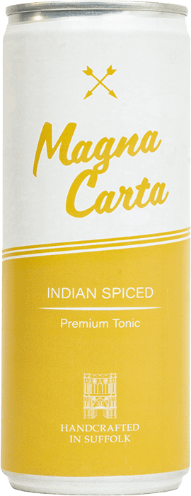
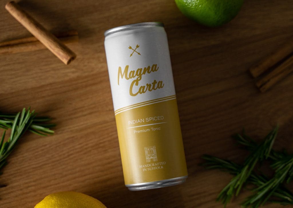
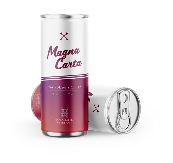
I designed the logo to feel like a hand-written script and used the two arrows from the Suffolk crest as it’s symbol. The colours were to be vibrant so they stood out from competitors but in a way that they felt familiar when picking flavours.
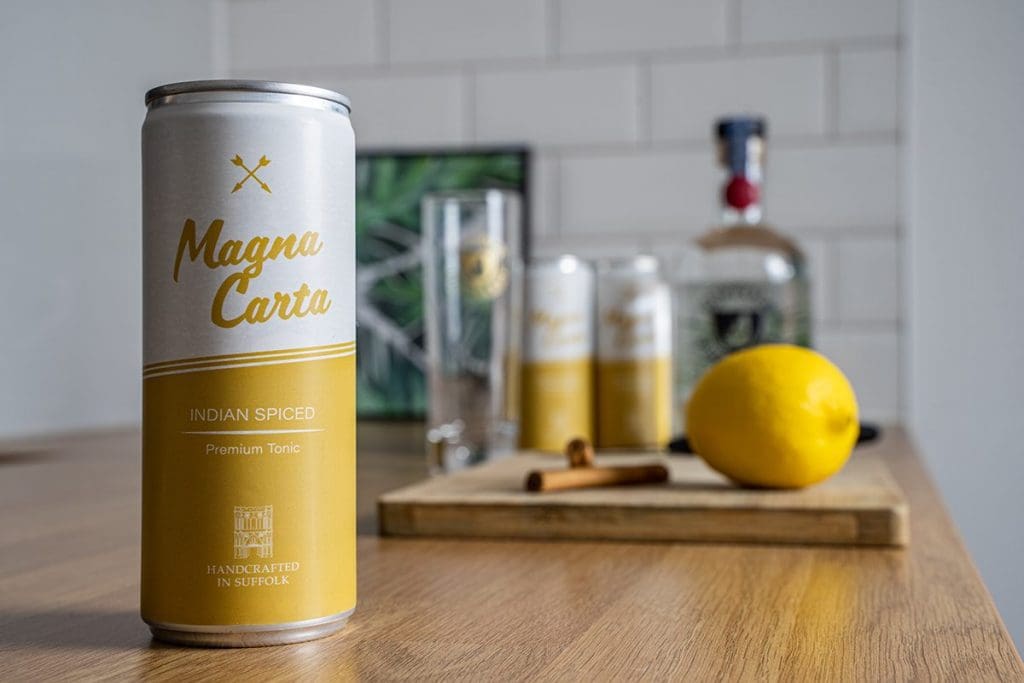
Slim can design
We decided that the brand’s packaging design was to be minimal and use colour to differentiate between flavours. Using a classic ribbon design for bold contrast to help the can pop on the shelves.
FINAL THOUGHTS
I really enjoyed the challenge of creating a design that wrapped the entirety of the can like this. The contrast of the colours restricted the placement of the product information but through restraints we sometimes find freedom. The client and I are pleased with the final design and it was great seeing the product sold across East Anglia and doing well.
GET IN TOUCH