
Useful Guides
Shopify Collection Page UX for High-Intent Ecommerce Stores
Collection pages are where most ecommerce decisions actually happen, yet they’re often designed as an afterthought rather than a system. This article looks at how we designed top-pillar collection pages during the “Time to Run” project, and why those decisions shaped the UX far more than visual styling alone.
Most ecommerce sites invest heavily in homepages and product pages. In practice, that’s rarely where decisions are made.
For stores with any meaningful range, collection pages are where intent sharpens. Users arrive knowing roughly what they want, but not yet how to choose. The structure of that page often determines whether they move forward or quietly leave.
This article is written from a practical standpoint, grounded in real constraints, and informed by how both specialist and large-scale ecommerce brands approach the same problem.
What we mean by top-pillar collections
A top-pillar collection is not just a category page.
It is one of a small number of collections that carry a disproportionate amount of responsibility across a site. These pages sit at the intersection of navigation, SEO and buying intent. They are often the first pages users land on from search, paid media or internal navigation.
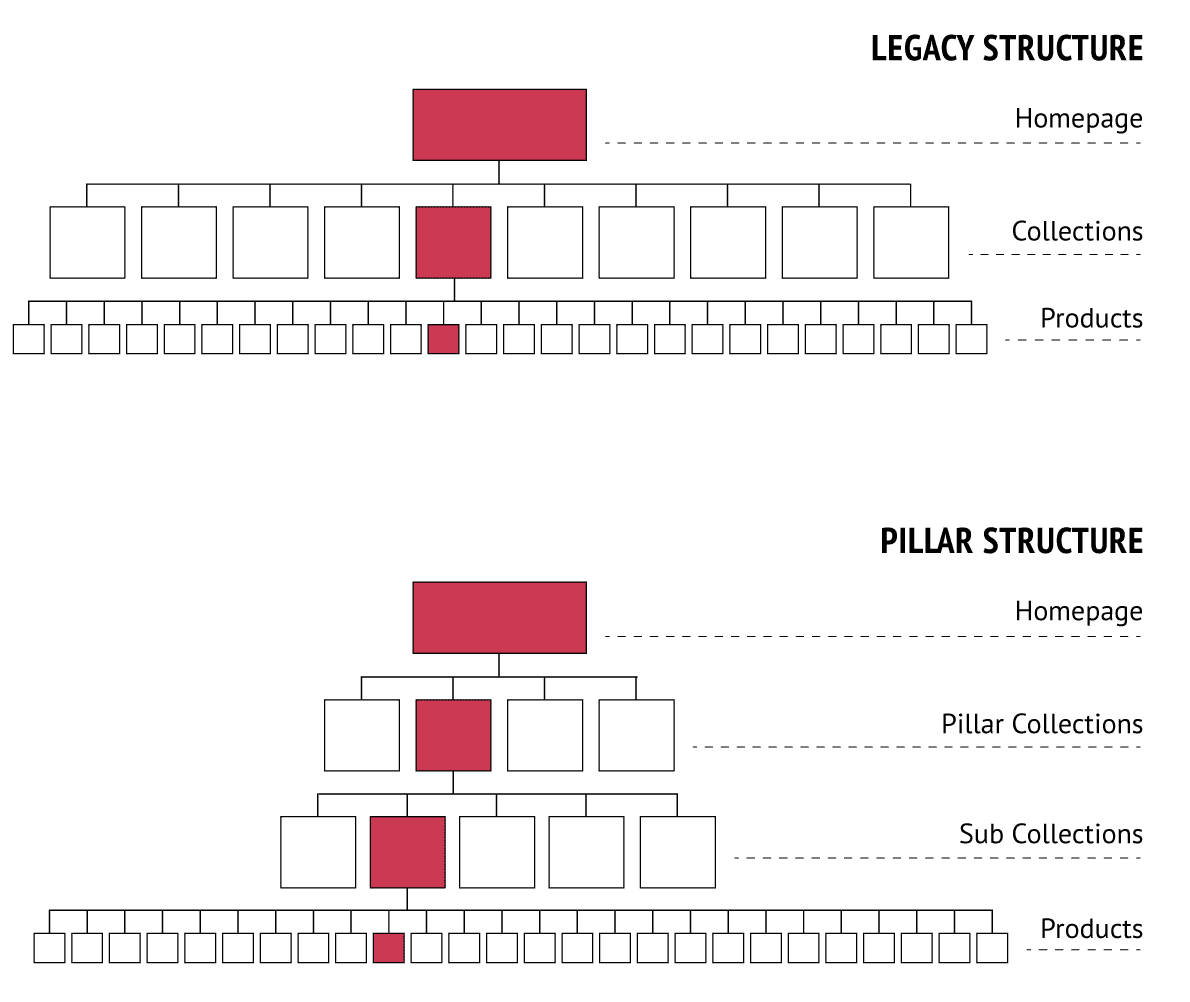
Most sites have too many top-level collections. The result is that none of them work hard enough. They become product dumping grounds rather than tools for decision-making.
A well-designed pillar collection should do three things clearly:
- Help users understand where they are
- Help them narrow choices without friction
- Reassure them they are in the right place
Everything else is secondary.
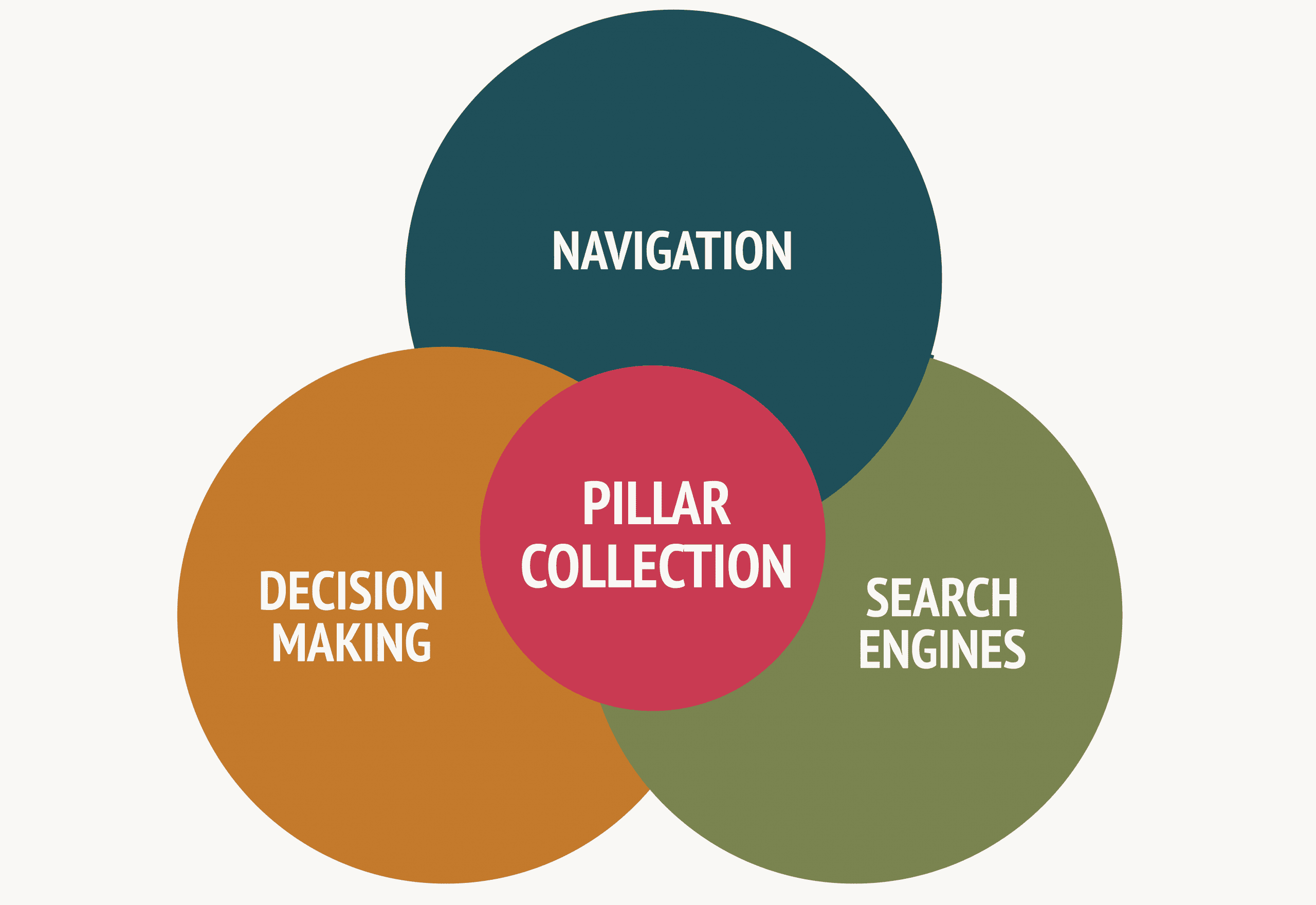
A conceptual Venn diagram showing how Pillar Collections sit at the intersection of UX and structure
ARTICLES OF INTEREST

Guide: How to improve your shopify Conversion Rates
5 Quick Tips to improve your chances of making a sale on your e-commerce store
Why this mattered on the “Time to Run” project
Time to Run was a Magento to Shopify migration paired with a theme upgrade. Technically, it could have been a straight lift and shift.
Instead, it became an opportunity to rethink structure.
Like many legacy builds, the existing architecture had grown organically. Categories reflected internal logic rather than user intent. Collections functioned primarily as long product lists.
Shopify’s simpler taxonomy forced a more fundamental question:
If someone lands on this collection page, what decision are they trying to make?
That question shaped the entire approach.
Designing the collection as a journey
Most collection pages are designed from the middle out. A product grid is dropped in, filters are added, and everything else becomes decoration.
We approached Time to Run’s pillar collections as a decision journey, not a grid.
The sequence was deliberate:
- Orientation
- Guided choice
- Comparison
- Reassurance
Each layer exists to answer a specific question at the right moment. If it doesn’t, it doesn’t belong on the page.
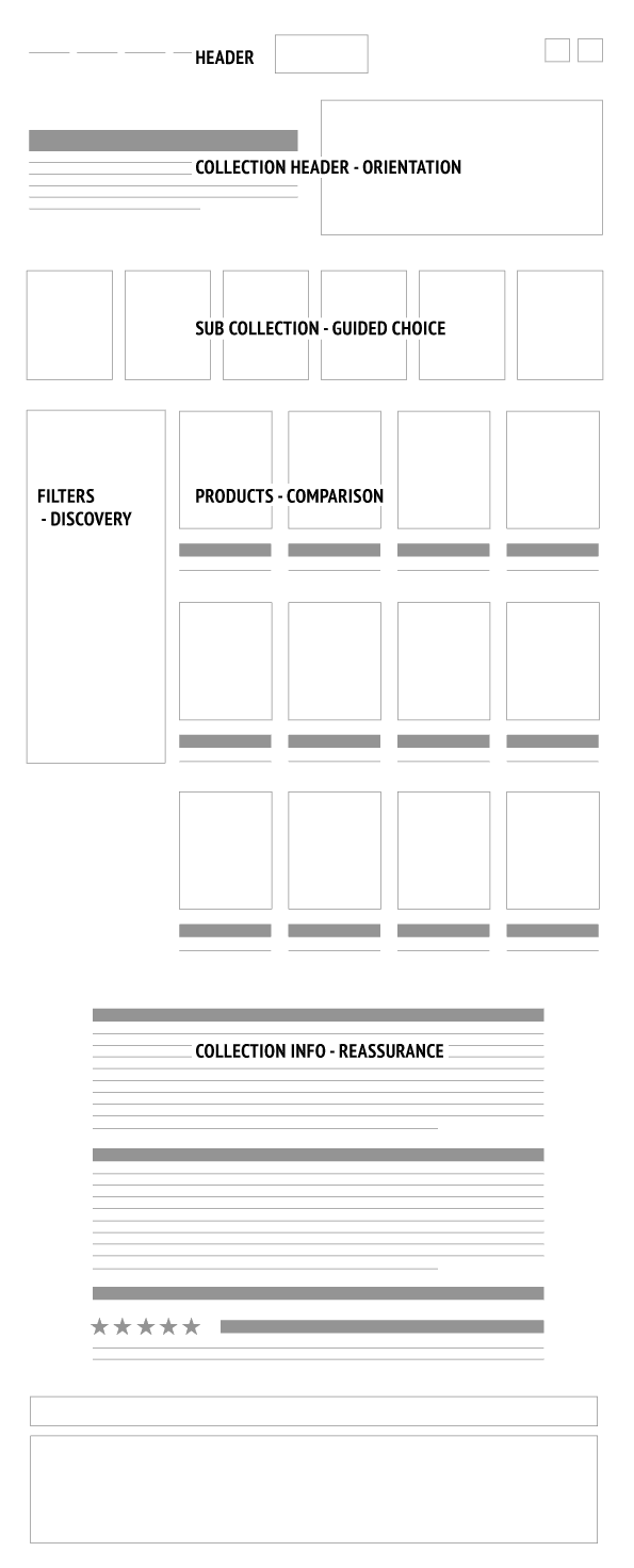
Orientation first with header, H1 & breadcrumb
At the top of the page, clarity matters more than personality.
The header and mega menus are infrastructure. Their role is to help users move laterally if they are in the wrong place, not to compete with the page itself. This is something large ecommerce brands generally get right. Navigation is predictable and restrained because it needs to be.
The H1 itself is literal and user-led. Not clever, not branded, not poetic. Users should know instantly what the page contains.
Breadcrumbs
Breadcrumbs are often treated as a UX requirement, but their usefulness depends on depth. In a shallow architecture like Time to Run’s, breadcrumbs add limited navigational value for users. The primary navigation and page hierarchy already make location clear.
For that reason, we positioned the breadcrumb in the footer. This keeps the upper part of the page focused on intent and decision-making, while still providing a clear structural signal for search engines.
In this context, breadcrumbs are primarily an SEO device, not a wayfinding tool.
Just below the H1 sits a short description. Two or three lines at most.
This is not storytelling. It is orientation.
What is this collection and who is it for?
This small block of copy helps users arriving directly from search and adds contextual relevance for SEO, without interrupting the buying flow.
Large brands often omit this because familiarity does the work for them. Smaller and specialist brands cannot afford that ambiguity.

Sub-collections as decision shortcuts
Filters are useful, but they ask users to do the work.
Sub-collections act as decision shortcuts. They say, start here.
Rather than mirroring internal taxonomy, we curated a small number of sub-collections based on real use cases runners recognise.
These were intentionally limited and clearly labelled.
This is an area where scale changes the approach. Large stores often rely heavily on filters because inventory demands it.
Smaller ranges can prioritise clarity over completeness.
If a sub-collection does not make sense without explanation, it does not belong on a pillar page.
- Women’s Running Clothing
– Pillar Collection- Women’s Running Pants & Tights – Sub Collection
- Women’s Running Thermal Jackets – Sub Collection
- Women’s Running Baselayers – Sub Collection
- Men’s Running Clothing
– Pillar Collection- Men’s Running Shorts
– Sub Collection - Men’s Running Jackets
– Sub Collection - Men’s Running Baselayers
– Sub Collection
- Men’s Running Shorts
- Running Accessories – Pillar Collection
- Running Head Torches – Sub Collection
- Running Gloves – Sub Collection
- Waterbottles – Sub Collection
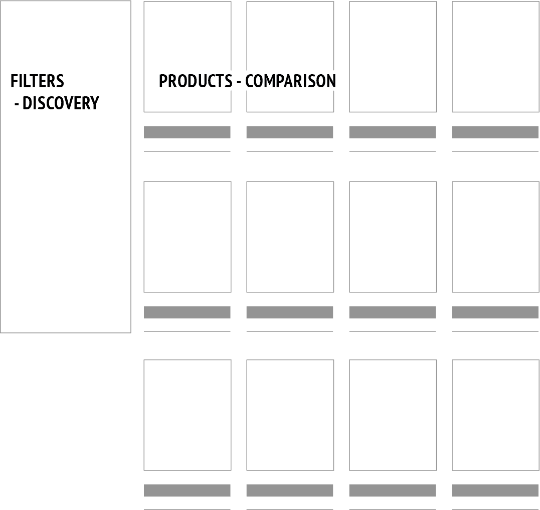
Filters as support, not strategy
Filters still matter, but they are not the primary decision-making tool.
Their role is to narrow choices once the user is already in the right context. Overloaded filters shift responsibility onto the user. Well-designed filters quietly support decisions the page has already helped frame.
This distinction is subtle, but it is where many ecommerce experiences quietly fail.
The product grid and reducing comparison friction
The product grid is not a billboard. It is a comparison tool.
Consistency matters more than novelty here. Clear pricing, predictable layouts and imagery that shows function rather than lifestyle all reduce scanning effort.
Badges and labels should only exist if they answer a real question. Otherwise, they become noise.
The goal is not to impress. It is to make comparison feel effortless.
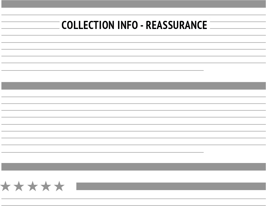
Depth without interruption using expandable content
SEO depth and good UX are often framed as opposing forces. They do not have to be.
For Time to Run, long-form explanatory content sits inside an expandable section. This allows users who want reassurance to access it, while letting others continue uninterrupted.
From an SEO perspective, the content is still present, relevant and contextual. From a UX perspective, it respects intent.
This was a deliberate trade-off, not a compromise.
What smaller brands can learn from larger ecommerce sites
Large ecommerce brands optimise for scale, familiarity and throughput. Their UX patterns exist because their context demands it.
Copying those patterns without the same brand weight often leads to thinner content, heavier reliance on filters and less clarity overall.
Smaller brands have an advantage. They can design for understanding rather than familiarity. Pillar collection pages are one of the places where that advantage shows most clearly.
Closing
Well-structured Shopify collection pages are rarely just product listings. At their best, they become structural tools that support navigation, discovery, SEO and decision-making all at once.
That level of thinking is often what separates stores that simply function from stores that feel calm, clear and commercially effective over time.
You may also be interested in…
Shopify Product Architecture
A Smarter Way to Handle Shopify Products for Variants, Inventory & SEO

Published
Last Updated