My Portfolio
Brand & Website Design for Ecological Garden Designers
Creating a naturalistic brand identity and website for new business venture, The Leif Collective
Client: The Leif Collective
I was asked by the lead gardener and owner of a new Suffolk Gardening business to design them a new brand identity and website to help celebrate the world of ecological gardening.
My goal was to create a new brand that celebrated ecological garden design with artistry and elegance.


Brand Strategy
After our initial strategy session we decided to capture the essence of ecological garden design in a simple logo which could be used across different platforms. The fundamental role of ecological gardening is to work within the confounds of a space and to allow nature to be the integral point which creates stunning outdoor spaces.
Logo Design
I wanted the logo to have an iconic meaning and to act as part of the brand’s storytelling. After many sketches I designed this to have two parts – design and freedom. This approach gave me the same balance ecological gardening has on its environment.
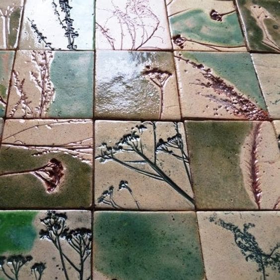
The circle first represents perfection in design; it’s a flawless shape and elegant. Then growing within these confounds is the wildflower illustration which is allowed to be its natural self and flourishes in the design.
Brainstorming & inspiration finding
Design Elements
Expanding the brand beyond the logo design
Typography
I used Hedvig Serif font from Google Fonts as not only does the font have clean modern lines but it also has fantastic ascenders and descenders that worked great with the icon concept – I really loved the ‘f’ character and how it overhangs the following character – free from it’s own confounds.

colour palette
The business is to provide a premium service to their clients. From online consultation sessions to landscaping. I wanted the colours to feel luxurious and something you’d find in a boutique. I designed the colour palette to celebrate the four seasons in a rich palette. We have fresh growth of spring green, a purple representing both blooming plants and ripening fruits of autumn followed by an earthy black of rich compost. These were to represent the full circle of life in the outdoors.


Find out more about how I work with businesses with their brand & Logo design
Visit my brand design service page for more information
Website Design
With WordPress at its core
The business wants to eventually provide virtual appointments and consultation for gardens of all sizes across the country so it was important we planned certain content to give this site mass appeal. Luckily the client likes writing as the main content strategy would involve the website growing its domain authority and becoming a leading destination for people wanting to learn and be inspired. This will be done through regular blogging and guest posting, something that comes naturally to the owner, which is a relief.
I designed the website on the obvious platform for the job, WordPress. This has blogging at its core and I knew how to design the site to be editorial, eventually allowing content to be easily found and read through organic SEO and high-performing, editorial design aesthetics.
View the website at www.theleifcollective.co.uk

Other Branding & Logo Design Projects
You may also be interested in…

Hartest Brewing co Branding
Discover how I created a brand for Hartest Brewing Co that stood out off the shelf by doing less

Under Twenty Beer Branding
This is how I created a logo design for a craft gluten-free beer using finger-painting and typographic scrawl.
GET IN TOUCH


