My Portfolio
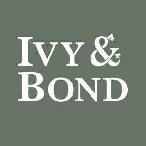
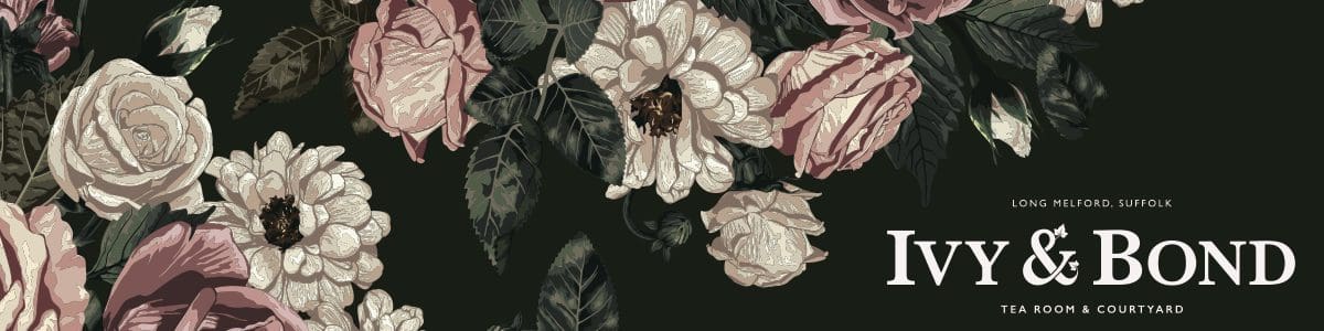
Ivy & Bond
Logo Design and Branding
New Vintage Tearoom Coming Soon to Long Melford, Suffolk
Client: Ivy & Bond
Independent tea room, IVY & BOND’s owner approached me in 2022 to provide brand and logo design services to help put some structure to their tearoom concept.
Helen sadly lost her husband, Paul to cancer earlier in the year. As a couple they shared a passion for good food and loved dining out together, visiting tearooms, bars and restaurants.
I met with Helen and we discussed her new tearoom business “IVY & BOND” which pays homage to their favourite restaurant – The Ivy. Paul also loved James Bond, in particular the humour, the “Britishness” and of course the style.
My brief was to design a tearoom brand that paid homage to Paul & Helen’s passions which would help the family move forward in 2023 but to also celebrate Paul, his life and his interests.
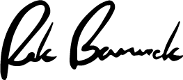
Thank you to Rik Barwick for bringing my ideas to life and creating our logo and brand.
Helen Clutterham, IVY & BOND
Paul would love it and it’s just perfect.
Designing the tea room
Brand’s look & FEel
How I developed the aesthetics of the brand to make sure
the design worked for the client.
The first stage of developing IVY & BOND’s brand design was to sit with Helen and discuss how she wanted the tearoom to feel. It wasn’t to be just another coffeeshop nor an old dated tearoom.
The vision was to have a tearoom that oozed style but classical. Timeless not fashionable. Class is permanent and that is how I wanted to pay homage to the key reference points of The Ivy and James Bond.
I started a Pinterest board to pull in inspiration, start developing references and eye-candy which would both get ideas flowing but also to excite the client and pushing their vision.
I find these vital to the development of a brand’s look and feel. This simple job helps me get into the mindset of the client and gives them the assurance that we’re on the same page. It also helps keep me working to the brief and pushing that instead of designing to the industry – which is no fun.
Logo design Key words & Phrases
Classical, Elegant, Timeless, Fun, Interesting, Artistic, It’s a Treat, Affordable, Town & Counrty, Horse & Hound
It’s important to design and push the brief – not the industry. That’s where the interesting work lies!
Me
The Tea Room’s Logo Design
Responsive Logo Design
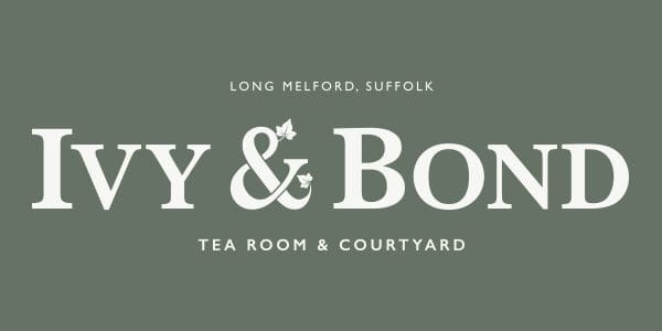
Logotype Design
Helen and I both agreed that we didn’t feel that Title Case lettering was going to look right with the character-count of the word “Ivy” being so short and the “y” character’s descender looking strange and causing an imbalance in how the words looked together. I felt ALL CAPS was too shouty and want to still give the impression of capitalising the names to give them authority.
I’m not one for noodling about reviewing 100’s of fonts when experience tells me that a few do the job of many. I wanted to combine a serif font and a sans-serif to create a modernised classic logo design.

I used Baskerville for the main typeface for this logo design. Baskerville is a timeless font first designed in the 1750s and is still widely used because it’s a such a refined font. I teamed this up a timeless classic – the modern British-designed classic sans font Gill Sans. Refined + Modern = IVY & BOND
Icon Design
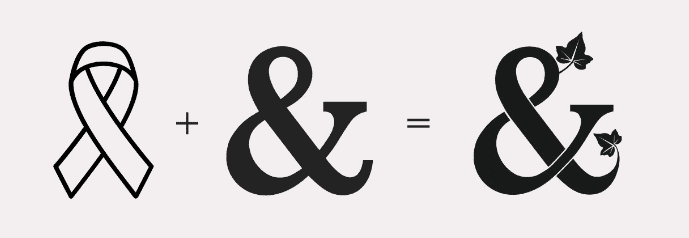
I wanted to add some symbology to the logo and whilst it’s very much a logotype logo design I still wanted it to have some kind of embellishment or point of interest.
The ampersand acted like a perfect key point for this. This whole businesses back-story and purpose is to give Helen and her family something to focus on and move their lives forward after the difficulty of dealing with Paul’s cancer. I wanted this to be forever part of the design. The cancer ribbon is a symbol for those living with all types of cancer. The ribbon is worn by people as a sign of support.
I designed the ampersand icon which combines the cancer ribbon and the Baskerville character with illustrated ivy leaves growing from the icon to symbolise the family’s past and future.

Find out more about how I work with businesses with their brand & Logo design
Visit my brand design service page for more information
The Tea Room’s SIGNAGE
& Design Elements
Expanding the brand beyond the logo design
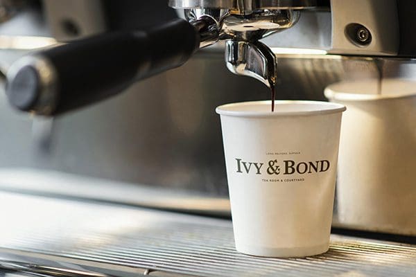
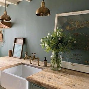
The Colour Palette
Helen and I both wanted the tearoom to pop from Long Melford’s high street – without being crass. During the research and development stage of the project we both fell in love with a range of interior paint colours by Fallow and Ball, in particular Green Smoke which inspired the primary colour to the brand’s colour palette.
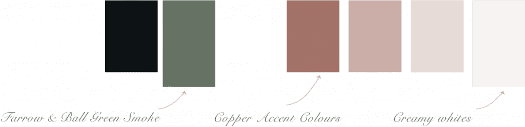
I’ve complimented the “Green Smoke” with a copper accent and various tints to add tone and hierarchy.
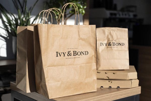
Cards and Stationery
Naturally Helen needed a range of printed material for the tearoom; gift vouchers, promotional materials, loyalty cards, etc.
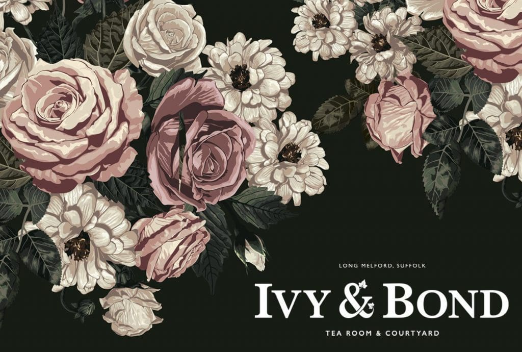
I designed these using some stock imagery of a vintage looking flower pattern – not a coffee bean or tea pot in sight. Just elegance and beauty. A nod to Suffolk’s silk trade and to The Ivy’s decor which Helen and Paul loved so much.
These items were to become the brands first customer touchpoint so I wanted them to impress and capture interest from the start. To give the sense of style and entice their custom and I think they’ve come out beautifully.


Other Branding & Logo Design Projects
You may also be interested in…
Hartest Brewing co Branding
Discover how I created a brand for Hartest Brewing Co that stood out off the shelf by doing less
Under Twenty Beer Branding
This is how I created a logo design for a craft gluten-free beer using finger-painting and typographic scrawl.
GET IN TOUCH